Alchemy Café – Branding & Packaging
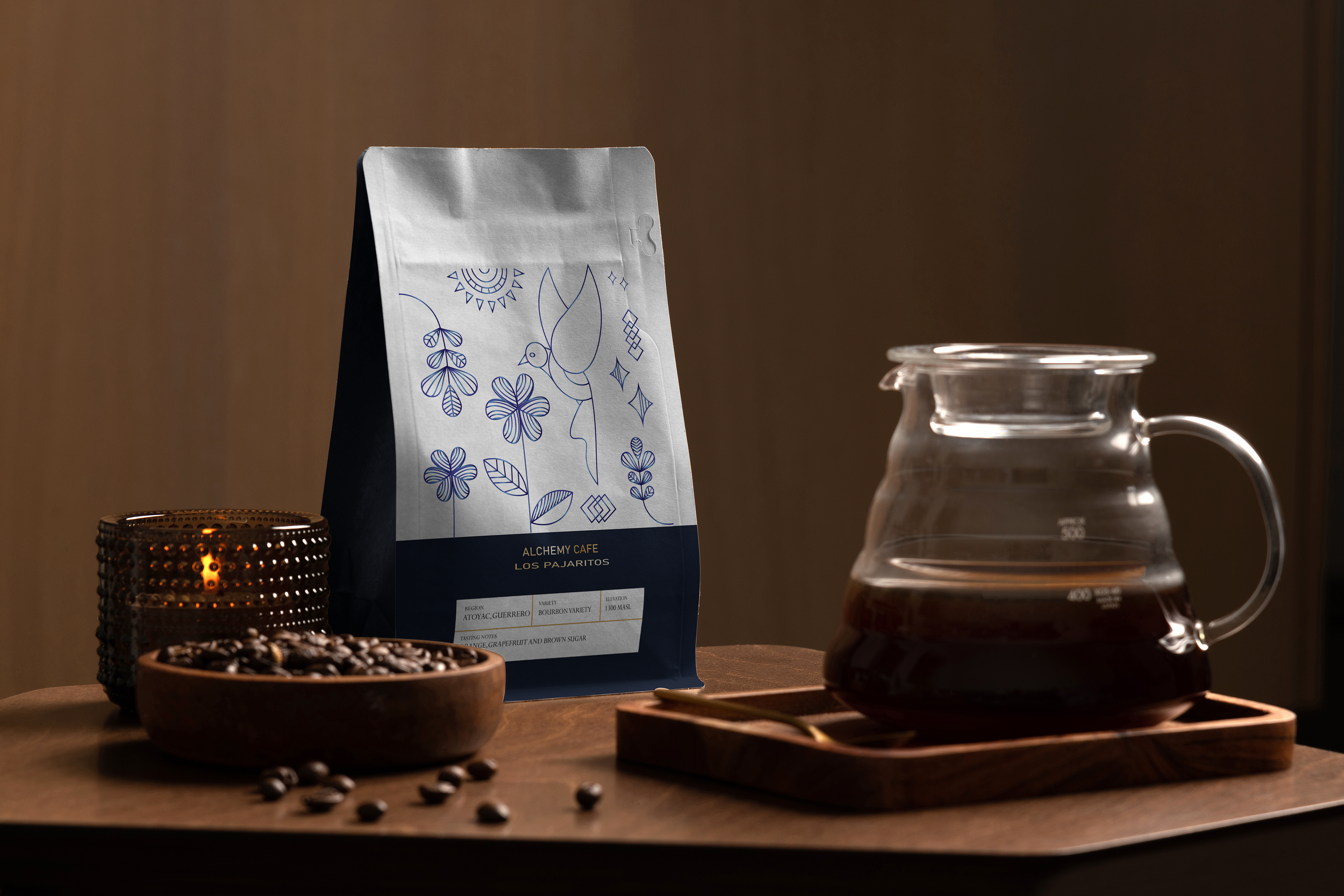
Alchemy Café is a packaging redesign for a Mexican coffee brand, reimagined through a visual system inspired by alchemy—the transformation of everyday elements into something elevated.
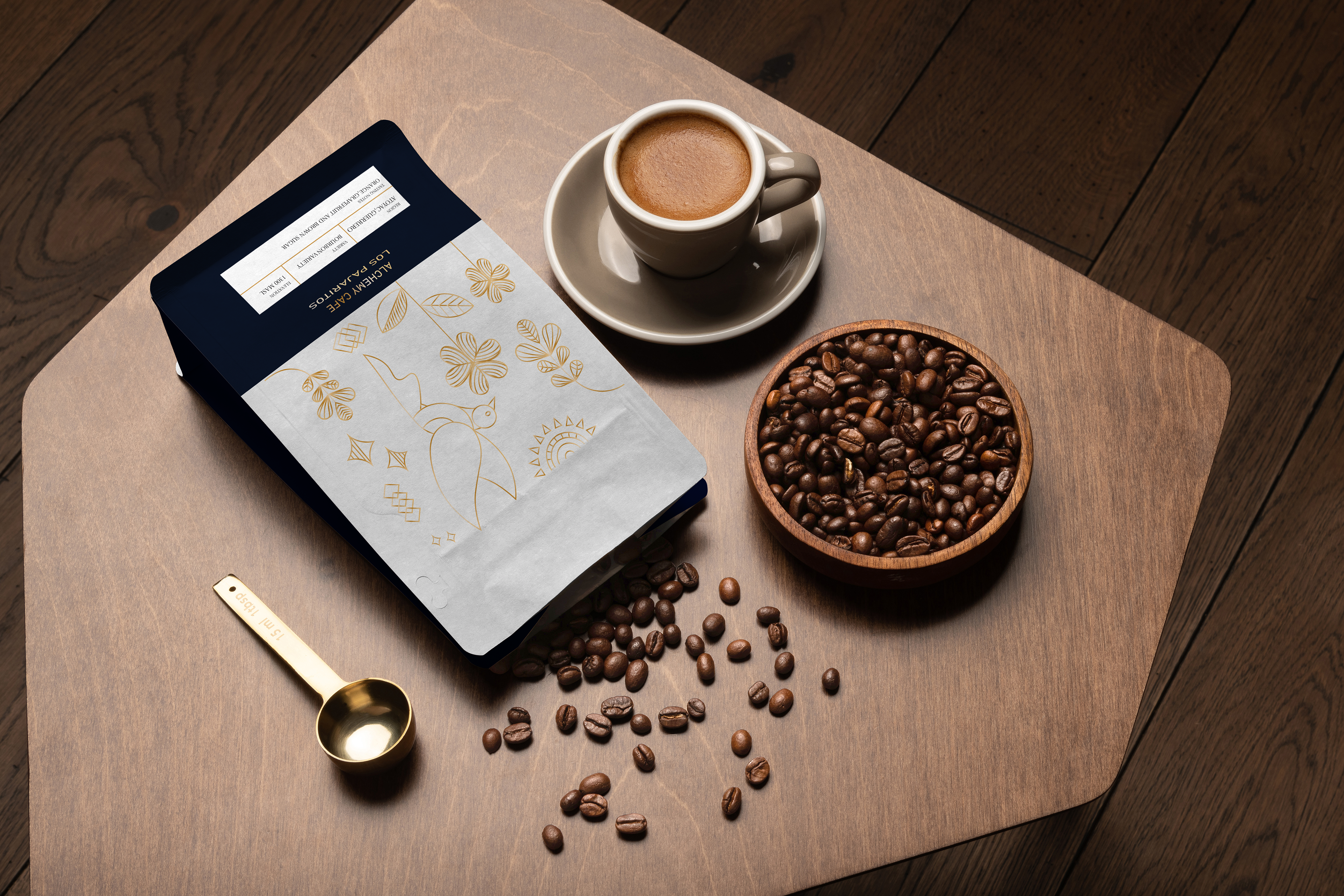
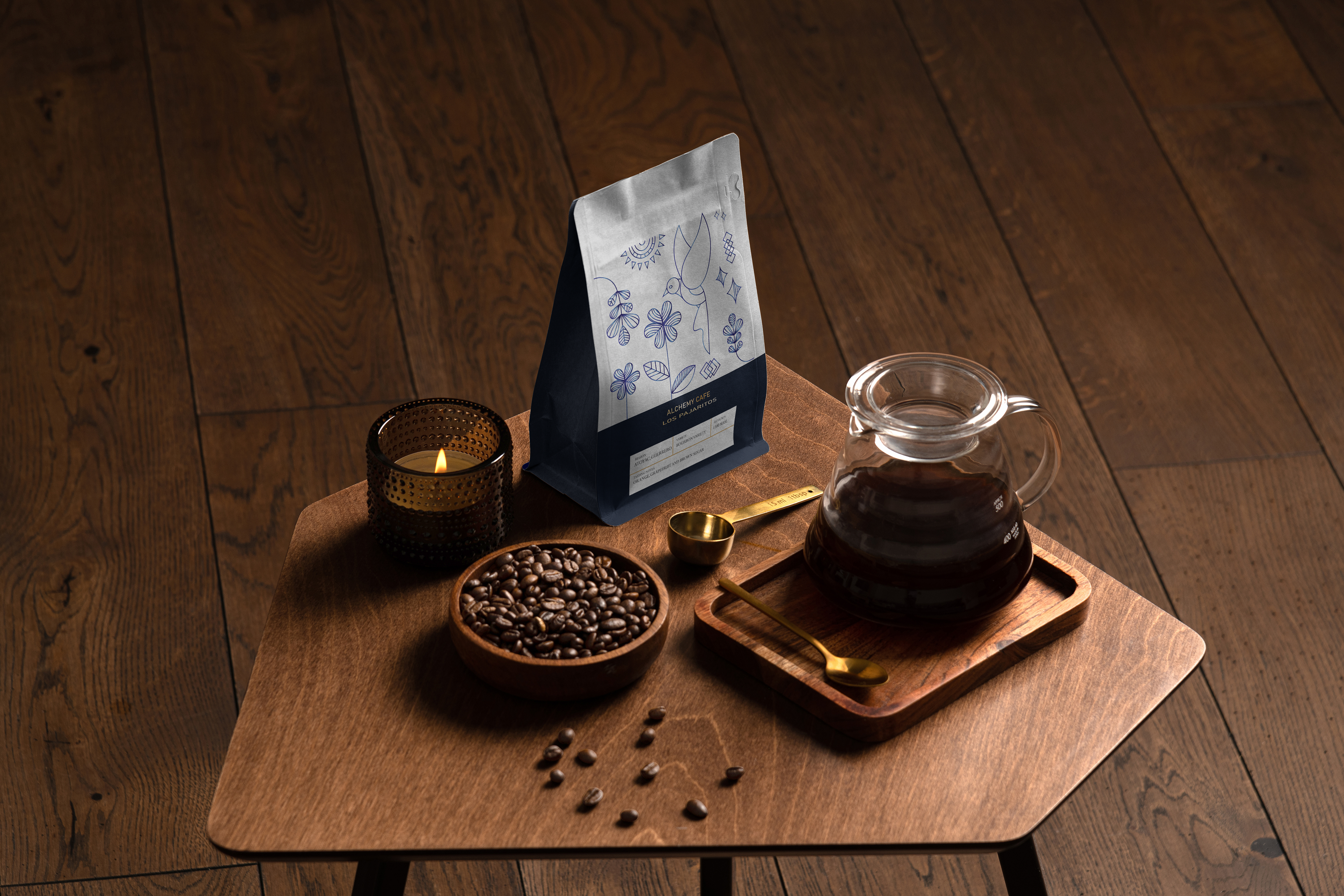
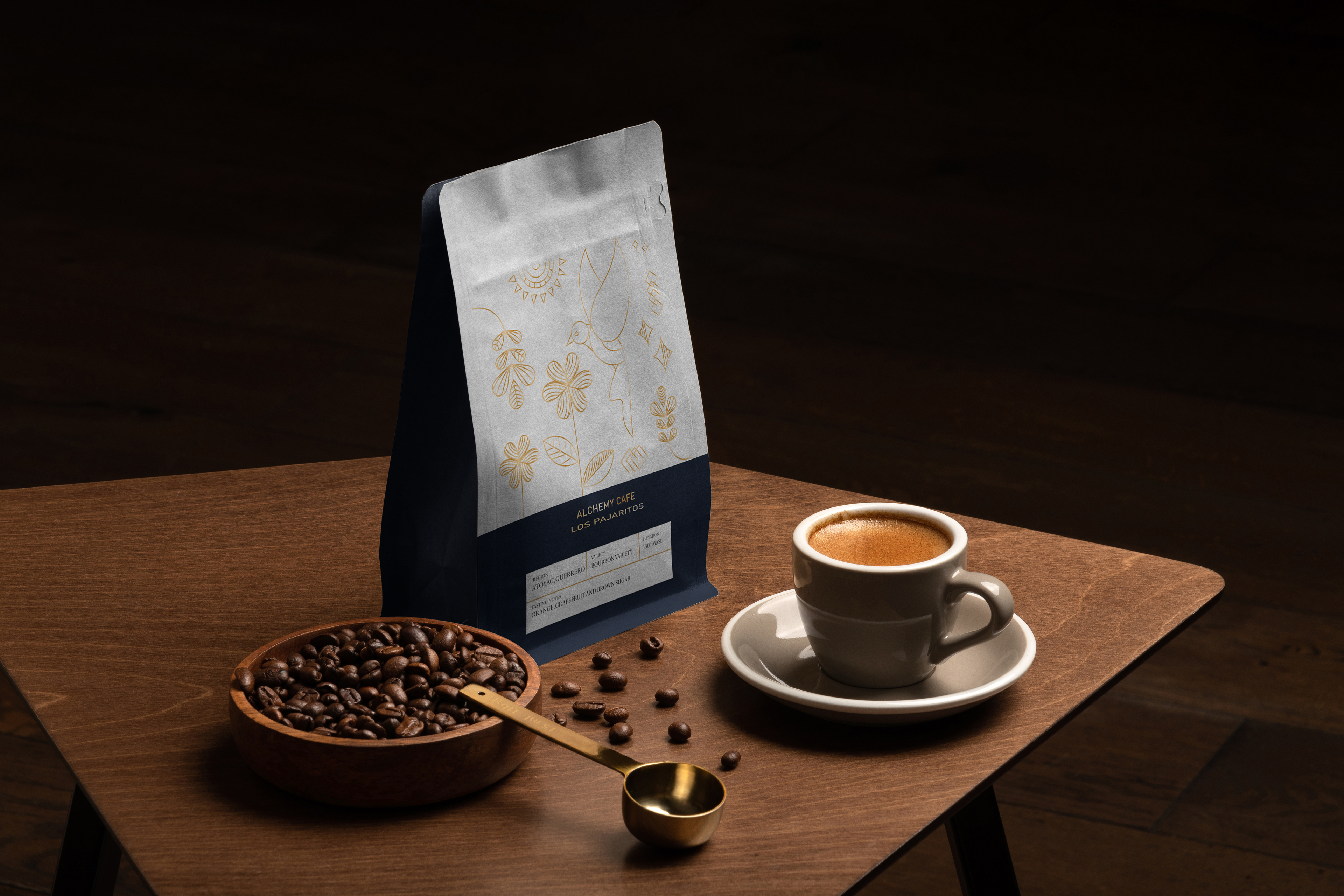
The packaging uses a refined metallic palette with gold and blue foil accents to express the character of each roast. The light roast is represented through radiant gold tones to suggest a crisp and delicate flavour profile, while the dark roast uses deep metallic blue to reflect boldness and complexity. These variations help differentiate blends while reinforcing a premium, artisanal positioning.
Inspired by the brand name Los Pajaritos (“The Little Birds”), a custom hummingbird icon was developed in a minimal line-art style influenced by Spanish design traditions. The hummingbird acts as a key visual element across packaging and supporting applications, symbolizing Mexico’s cultural vibrancy and craftsmanship.
Typography pairs an elegant serif logotype with a clean sans serif for readability and balance. The layout is structured with a clear visual hierarchy and considered white space to highlight key information and emphasize the foil detailing across the packaging.
Tools: Adobe Illustrator, Adobe Photoshop, Adobe InDesign
Skills: Branding, Packaging Design, Illustration, Typography, Visual Identity
Skills: Branding, Packaging Design, Illustration, Typography, Visual Identity